Looking back, 2016 seemed extraordinarily punishing in terms of the number of famous people we lost. While the Baby Boom is certainly not a mystery to anyone, I wanted to use 2016 as a baseline to see just how much worse it's going to get before it gets better.
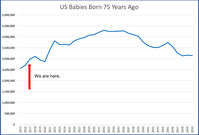
Using data from the Wall Street Journal (link below), I simply plotted live births from 1940 to 1975, then adjusted the x-axis by 75 years to provide a 75-year rearview mirror.
No matter how we slice the data, if you thought 2016 was bad in terms of losing important people, it appears we're only getting started, and you can expect climbs for at least the next 15-20 years:
Data Source: Wall Street Journal
Disclaimers:
- Note I said "babies born 75 years ago," not necessarily "number of people who will turn 75 this year." You can (and the WSJ did) document live births, but you can't use that data to assume they're all still living and will turn 75. Use the data curve as a general trend, not a guarantee.
- 75 is an arbitrary number meant to aggregate a lifespan. Clearly, many things go into lifespan calculation, and it's likely that lifespan has grown (and will continue to grow) throughout this curve, which will eventually skew it.